14 de julho de 2025
 ITKF’s new brand expresses the innovation, strength and movement that guides the sport today
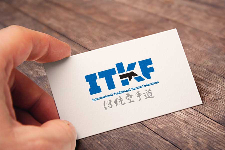
The new letters of the brand were sized to match with each other and are authentic, that is, they were designed exclusively for the institution
Sportive Management
December 1st of 2019
By PAULO PINTO I Pictures by BUDOPRESS
Curitiba – PR
Among the numerous innovations promoted by the executive board of the International Traditional Karate Federation (ITKF), the visual identity stands out, which, besides being present in the logo, covers all the graphic material used in the communication of the world entity with its affiliates.
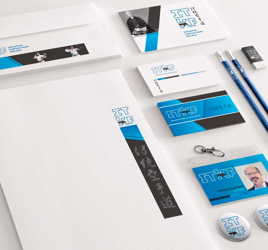
Various moments of the ITKF brand
To promote the change, the sport managers contacted Marcelo Azevedo, a karate black belt and one of the most renowned graphic artists in Paraná who, according to Gilberto Gaertner, president of ITKF, was inspired by the principles of budo.
“We asked the renowned designer Marcelo Azevedo to update the ITKF logo, because in the previous change of the logo the vertical lines became horizontal, with clear influence of the IBM brand, which at that time was a symbol of a successful company. We asked him to maintain the initial idea of ITKF from original elements and connected with the essence of traditional karate. I think the biggest insight was to develop the K from the image of master Nishiyama in kokutsu-dachi”, explained the presidente.

The designer Marcelo Azevedo in his studion in Curitiba
Graphic designer with extensive experience, Azevedo explained that the processo f updating a brand should not be based solely on fad or change of color or style. There must be well-defined criteria and purposes that relate to technical, functional, symbolism, cultural and aesthetic factors, among others.
“A brand has its history, which must be respected as well as its origins and its essence. Modernizing your appearance can create a sense of growth, innovation, confidence and dynamism. The communication has changed a lot in the last years, making the brands follow the movement. Today, large companies are working on simplifying their brands. The visualization on mobile phones demands that the reading of the mark it’s fast and pregnant, that is, it makes a strong impression. The more elements, effects, gradients, and details, the harder it is to pin down the essence of the brand. A good brand should have an excellent readability, even in very small sizes or applied in a single color”, detailed the graphic artist.
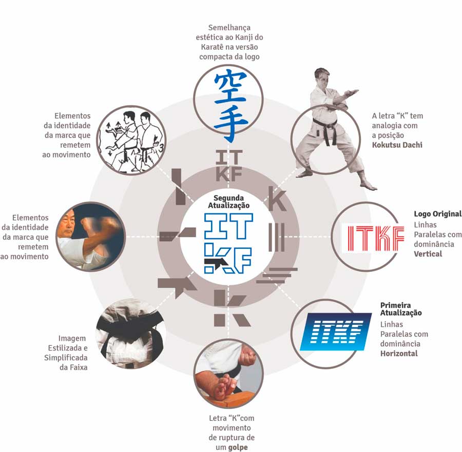
Evolution of ITKF’s logo
Born in December 27 of 1968 and graduated in industrial design and product design from the Universidade Federal do Paraná (UFPR), Marcelo Gonçalves Azevedo stressed the importance of maintaining a unique standard in the presentation of visual identity.
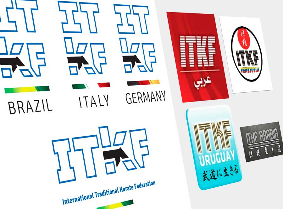
“Regarding the above mentioned purposes, we realize that, for ITKF, the unification of visual identity will be very important. We realized that each country has been using a different form of the brand, thus fragmenting its cohesion in communication. In this sense, we have developed a simple pattern to situate the brand internationally. With a bar in the colors of the country flags and their names below, we unify your presentation. The new brand also gained, in addition to traditional horizontal writing, the square and vertical arrangements, allowing to choose the filling of the letters or work only their outline. This increases the flexibility of applications according to the varied communication needs without impairing their reading in the various media”, he said.
Application of the ITKF logo
For the graphic artist, in the redesign of the ITKF brand the letters were sized to get a good relationship with each other and are authentic, that is, they were designed exclusively for the institution. The strength given to the letter K is reminiscent of karateka in the kokutsu-dachi position, with its black belt, which symbolizes in itself the practitioners’ goal of improvement. “Simply applying the letter K to a social network profile already identifies the brand as a whole. In this single element, seen in isolation, are all the attributes of value and the philosophy of ITKF as an institution guided by the principles of budo, whose aim is to popularize and develop traditional karate in the friendly relationship between the members of all countries in the advance. world sport and in contributing to human development ”, concluded the designer from Curitiba.
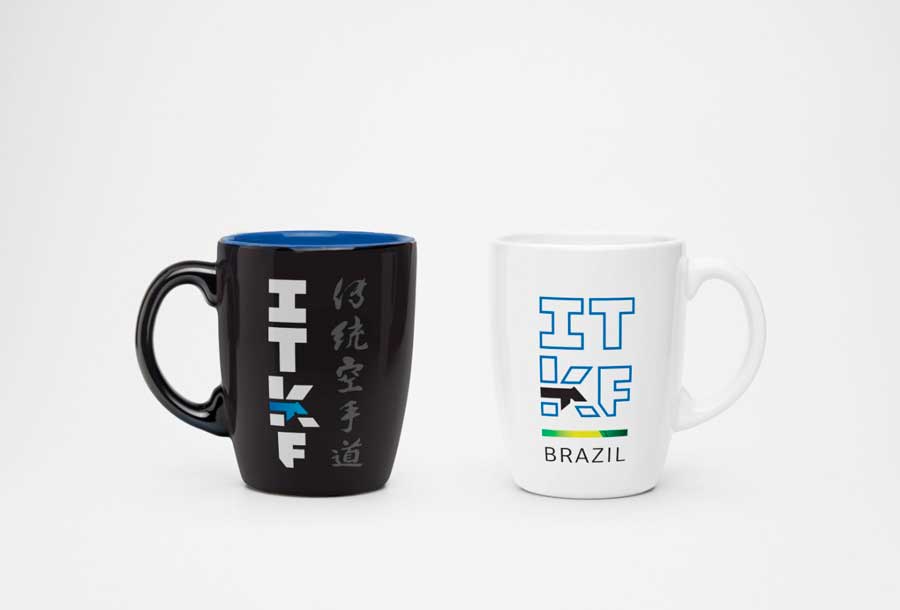
ITKF tea-cups
The ITKF president stressed the importance of all national federations adopting the brand that synthesizes the new moment of traditional karate.
“It is important to remember that we have not developed a new logo, but an update that is in line with our current moment. Just as the logo has been updated, ITKF as an institution needs to adapt to the new reality imposed by the technological and behavioral changes we are experiencing. Would be ideal if all national federations use the possible variations of the logo to standardize the traditional karate brand globally and embrace the entity’s new momentum, ”said Gilberto Gaertner.
Marcelo Azevedo sought to maintain some aspects of the original brand in some applications of the new brand, maintaining, for example, the contour lines that form the letters in unfilled applications
The main objective of the new logo is to strengthen, through the graphic image, the work of ITKF aiming to popularize and develop the traditional karate

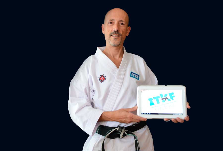
One of the numerous applicability of the ITKF brand

Authenticity is the highlight of the new ITKF brand